Covid19 and the fatality ratio
Visualizations and data exploration of governmental measures 🦠
R analysis of COVID19

The World Health Organization has declared the outbreak a pandemic and it has spread to more than 190 countries around the world. Here the goal is to provide a visual narrative of the spread of Covid-19 and compare some macro trends across countries, focusing on the Italian case as the first European country hit by the outbreak.
To do so, I’ve used several R packages and web repositories which are provided in the references section.
covid19_dta ## # A tibble: 84,026 x 40
## iso3c country date confirmed deaths recovered ecdc_cases ecdc_deaths
## <chr> <chr> <date> <dbl> <dbl> <dbl> <dbl> <dbl>
## 1 ABW Aruba 2020-03-13 NA NA NA 2 0
## 2 ABW Aruba 2020-03-14 NA NA NA 2 0
## 3 ABW Aruba 2020-03-15 NA NA NA 2 0
## 4 ABW Aruba 2020-03-16 NA NA NA 2 0
## 5 ABW Aruba 2020-03-17 NA NA NA 2 0
## 6 ABW Aruba 2020-03-18 NA NA NA 2 0
## 7 ABW Aruba 2020-03-19 NA NA NA 2 0
## 8 ABW Aruba 2020-03-20 NA NA NA 4 0
## 9 ABW Aruba 2020-03-21 NA NA NA 4 0
## 10 ABW Aruba 2020-03-22 NA NA NA 4 0
## # ... with 84,016 more rows, and 32 more variables: total_tests <dbl>,
## # tests_units <chr>, positive_rate <dbl>, hosp_patients <dbl>,
## # icu_patients <dbl>, total_vaccinations <dbl>, soc_dist <dbl>,
## # mov_rest <dbl>, pub_health <dbl>, gov_soc_econ <dbl>, lockdown <dbl>,
## # apple_mtr_driving <dbl>, apple_mtr_walking <dbl>, apple_mtr_transit <dbl>,
## # gcmr_place_id <chr>, gcmr_retail_recreation <dbl>,
## # gcmr_grocery_pharmacy <dbl>, gcmr_parks <dbl>, gcmr_transit_stations <dbl>,
## # gcmr_workplaces <dbl>, gcmr_residential <dbl>, gtrends_score <dbl>,
## # gtrends_country_score <int>, region <chr>, income <chr>, population <dbl>,
## # land_area_skm <dbl>, pop_density <dbl>, pop_largest_city <dbl>,
## # life_expectancy <dbl>, gdp_capita <dbl>, timestamp <dttm>Covid-19 Spread over time
The plot visualize the spread of the virus in relation to governmental intervention measures!
The curve trend for deaths rate
plot_covid19_spread(
  covid19_dta, type = "deaths", min_cases = 1, min_by_ctry_obs = 7,
  edate_cutoff = 550, per_capita = FALSE, log_scale = TRUE,
  cumulative = FALSE, change_ave = 7,
  highlight = c("ITA", "FRA", "DEU", "ESP", "GBR", "USA", "CHN", "BEL"),
  intervention = "lockdown")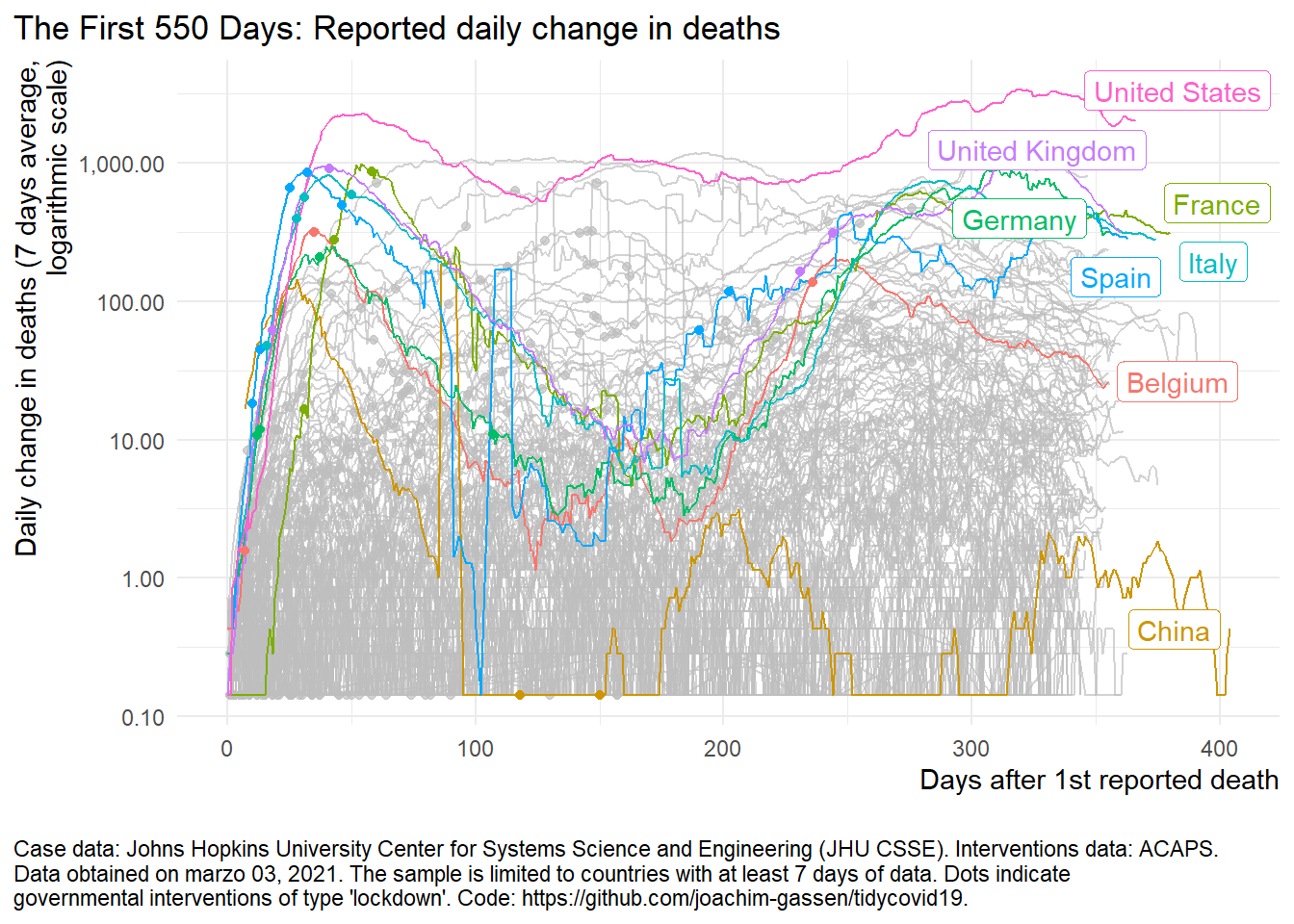
The curve trend for recovered rate
plot_covid19_spread(
  covid19_dta, type = "recovered", min_cases = 1, min_by_ctry_obs = 7,
  edate_cutoff = 550, per_capita = FALSE, log_scale = TRUE,
  cumulative = FALSE, change_ave = 7,
  highlight = c("ITA", "FRA", "DEU", "ESP", "GBR", "USA", "CHN", "BEL"),
  intervention = "lockdown")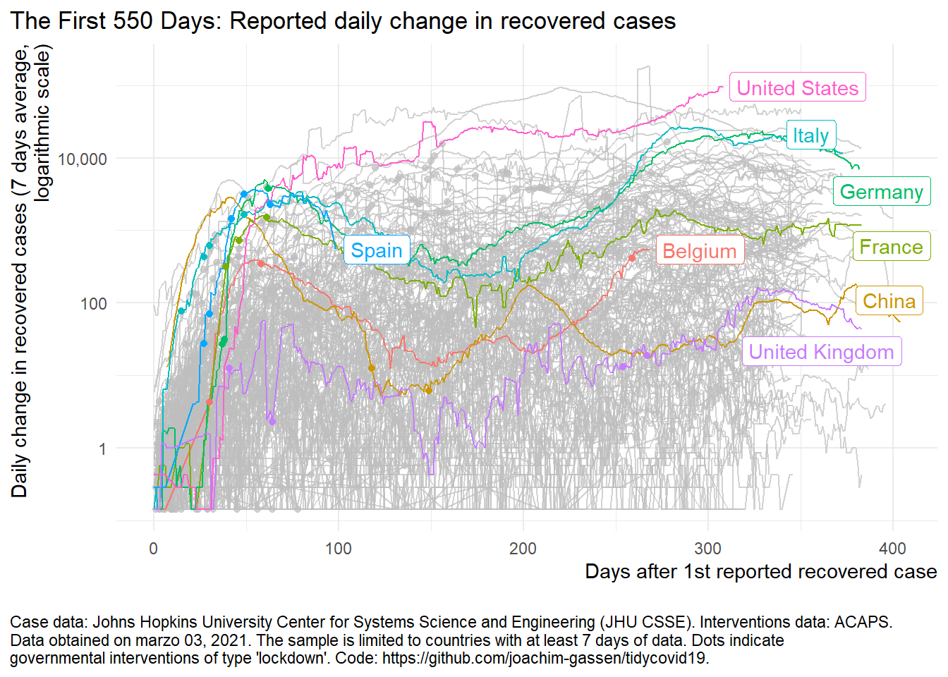
The case fatality rate
How bad will the coronavirus outbreak get?
The case of fatality rate (CFR) is a ratio that measure the risk of COVID-19 dying.
To understand what the case fatality rate can and cannot tell us about the outbreak, it’s important to understand why it is difficult to measure and interpret such ratio. CFR is not a biological constant! instead, it reflects the severity of the disease in a particular context, at a particular time, in a particular population. The probability that someone can die from a disease doesn’t just depend on the disease itself, but also on the treatment they receive and on the population characteristics. This means that the CFR can decrease or increase over time, as responses change. So, health policy employed have a huge impact on the CFR evolution, and might tells a lot about how that policy has been exploited.
my_line <- c(100,1000,10000, 100000, 1400000, 15000000)

covid_dt %>%
  filter(iso_code %in%  c("USA","ITA","GBR","ESP","DEU", "SWE", "CHN", "FRA")) %>%
  ggplot(aes(total_deaths, total_cases, colour = iso_code)) +
  geom_line(size = 0.3) +
  geom_point(size = 0.8) +
  scale_x_log10(labels = scales::comma) +
  scale_y_log10(labels = scales::comma,limits = c(10, 25000000)) +
  theme_minimal() +
  coord_flip() +
  annotate(geom = "line", x = my_line/5, y = my_line, lty = "dotted") +
  annotate(geom = "line", x = my_line/10, y = my_line, lty = "dotted") +
  annotate(geom = "line", x = my_line/20, y = my_line, lty = "dotted") +
  annotate(geom = "line", x = my_line/40, y = my_line, lty = "dotted") +
  annotate(geom = "line", x = my_line/80, y = my_line, lty = "dotted") +
  annotate(geom = "text",x = 100/5, y = 100,label = paste0(100/5, "%"),hjust = 1, size = 2) +
  annotate(geom = "text",x = 100/80, y = 100,label = paste0(100/80, "%"),hjust = 1, size = 2) +
  annotate(geom = "text",x = 100/10,y = 100,label = paste0(100/10, "%"),hjust = 1, size = 2) +
  annotate(geom = "text",x = 100/20,y = 100,label = paste0(100/20, "%"),hjust = 1, size = 2) +
  annotate(geom = "text",x = 100/40,y = 100,label = paste0(100/40, "%"),hjust = 1, size = 2) +
  annotate(geom = "text",x = 500,y = 7, label = "..percent of cases..", angle = 45, size = 4) +
  ggtitle("COVID-19: Total confirmed cases vs. deaths") +
  ylab("Total confirmed cases") +
  xlab("Total confirmed deaths") +
  geom_dl(aes(label=location), method = 'last.bumpup',
          angle = 20, hjust = 0.3) +
  theme(legend.position="none")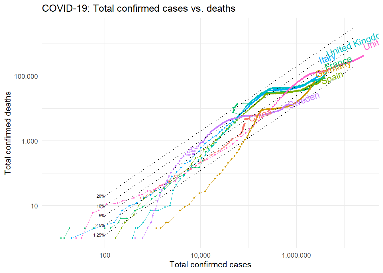
References:
R packages: {tidycovid19}
Cases provided by JHU
Financial Times: Coronavirus tracked
European Centre for Disease Prevention and Control (ECDC)
Salvatore Pirri
Value & Market Access Specialist - Research Affiliate in Health Economics
My research interests include Economics, machine learning and R programming.